
 Search Here
MISC
Parts List
Robot Forum
Chat
Member Pages
Axon MCU
Robot Books
Shop
Contact
SKILLS
How To Build
A Robot
Tutorial
Calculators
Mechanics
Programming
Miscellaneous
Robots
Space
HARDWARE
Actuators
Batteries
Electronics
Materials
Microcontrollers
Sensors
SCIENCE
Robot Journals
Robot Theory
Conferences
- Gather Sensor Data (data logging)
- Graph Sensor Data
- Generate Line Equation
Robot Sensor Interpretation
Most roboticists understand faily well how sensors work. They understand that most
sensors give continuous readings over a particular range. Most usually understand
the physics behind them as well, such as speed of sound for
sonar or sun interference
for IR. Yet most do not understand how to interpret sensor data into a mathematical
form readable by computers. Roboticists would just make case based situations
for their sensors, such as 'IF low reading, DO turn right' and
'IF high reading, DO turn left.' That is perfectly ok to use . . . unless you want fine angle
control. The other problem with case based programming is if your sensor reading bounces
between two cases, your robot will spass out like crazy (oscillate).
Most amazingly, to do fine angle control is actually almost just as simple.
There are only 3 steps you need to follow:
The first step is incredibly simple, just somewhat time consuming. Graphing just takes minutes. And generating the line equation is usually just a few clicks of your mouse.
Gather Sensor Data
This is fairly straight forward. Do something with your sensor, and record it's output using Excel.
If you have a range sensor (such as sonar or
Sharp IR),
record the distance of the object in front of it and
the range data output. If you have a photoresistor,
record the amount of light (probably arbitrarily . . . # of candles maybe?) and the sensor data
from it. If you have a force sensor, apply weight to it, record the weight, and yes, the data.
This is very simple and probably brain deadening easy, but there are a few things you
will have to watch out for.
First is non-continuity. Some sensors (such as sonar and Sharp IR) do not work properly at very close range. Stupid physics, I know.
The next is non-linearity. For example, your sensor readings may be 10, 20, and 30. But the distance might be 12cm, 50cm, and 1000cm. You will have to watch for these curves. Usually however they occur only near the minimum and maximum values a sensor can read.
Then there is sensor noise. Five readings in the same exact situation could give you five near yet different values. Verify the amount of sensor noise you have, as some sensors can have it fairly bad. The way to get rid of noise is get a bunch of readings, then only keep the average. Make sure you test for noise in the actual environment your robot will be in. Obvious, but some desktop robot builders forget.
The last issue you will have is the number of data points to record. For perfectly linear sensors you only need to record the two extremes, and draw a line between them. However since this is almost always not the case, you should record more. You should always record more points the more non-linear your sensor is. If your sensor is non-linear only at certain cases, record extra points just in those cases of concern. And obviously, the more points you have recorded, the more accurate you can get your sensor representation. However do you really need 10,000 points for a photoresistor? Its a balance.
Graph Sensor Data
Ok now that you have all your data recorded in two columns in Excel, now you need to graph it.
But this is simple.
1) First scroll with your mouse and highlight the cells with data in the first column.
2) Then hold Ctrl and scroll the cells in the other column of data. You should now have
two columns seperately highlighted.
3) Next click the graph button in the top menu.
4) A window should open up. Select XY (Scatter). Then in Chart sub-type select the middle
left option. Its the one with curvy lines with dots in them. Click next.
5) If you want to compare multiple robot sensors, use the Series tab. Otherwise just
use the Data Range tab. Make sure the 'Series in: Columns' is selected. Click next.
6) Pick the options you want, label your chart, etc. Click next and finish. A chart should now appear.
7) Still confused? Download my excel sensor graph examples.
There are some possible graphs you may see with your sensors:
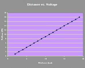
This above graph is of a linear sensor. There is a straight line, so a simple 10th grade y=x*c+d equation can predict distance given a data value.
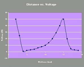
This above graph is non-continuous and non-linear. You will see crazy stuff happen at the beginning and end of the graph. This is because the sensor cannot read at very close distances or very far distances. But it is simpler than it looks. Crop off the crazy stuff, and you will get a very simple non-linear x=y^2 line. You basically need to make sure that your sensors do not encounter those situations, as a program would not be able to distinguish them from a normal situation.
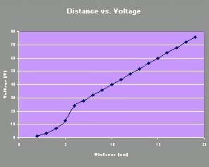
Although this above graph looks simple, it can be a little tricky. You actually have two different lines with two different equations. The first half is an x=y^2 equation and the second half is a linear equation. You must do a case based program to determine which equation to use for interpreting data. Or if you do not care about accuracy too much, you can approximate both cases as a single linear equation.
Generate Line Equation
After determining what kind of graph you have, now all you need to do is use the excel trendline ability.
Basically this will convert any line into a simple equation for you.
1) If there is no non-continuities (kinks in the graph),
right click the line in the graph, and click 'Add Trendline..." If you
do have a non-continuity, seperate the non-continuous lines and make two graphs. That way each can be interpreted
individually. If you do not care about error, or the error will be small, one graph is fine.
2) Now select the Trend/Regression type. Just remember, although more complex equations can
reduce error, it increases computation time. And microcontroller
usually can only handle linear and
exponential equations. Click OK and see how well the lines fit.
3) Now click the new trendline and click 'Format Trendline.' A new window should appear.
4) Go to the Options tab and check the box that says 'Display equation on chart.'
Click OK.
5) There you have it, your equation that you can use on your robot! Given any x data value, your
equation will pump out the exact distance or light amount or force or whatever.
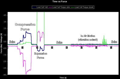
Load Cell Linearity Graph Example
This is a graph and equation I generated using a Load Cell (determines force). I had to put the sensor
in a voltage amplifier to get a good measurable voltage.
Society of Robots copyright 2005-2014